

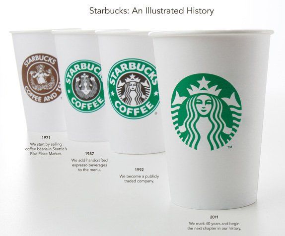
As the official
40th anniversary of the coffee giant, Starbucks, the company has chosen to launch an all new "wordless" logo. Going a more minimalistic route, Starbucks' new duds feature an unshakable version of their infamous mermaid with all the words removed from it. A bold move to be sure, but one not so different than Nike's swoosh or McDonald's golden arches. It definitely conveys a confidence in both the brand and in the loyalty of its customer.

The mermaid herself has also received a few nips and tucks according to Senior Creative Manager of Starbucks in-house team, Mike P, "...we enhanced her form in subtle ways, smoothing her hair, refining her facial features, weighting the scales on her tail to bring the focus to her face. We enlisted the branding firm of Lippincott to help with these refinements, and give us a better global perspective on the entire identity system."
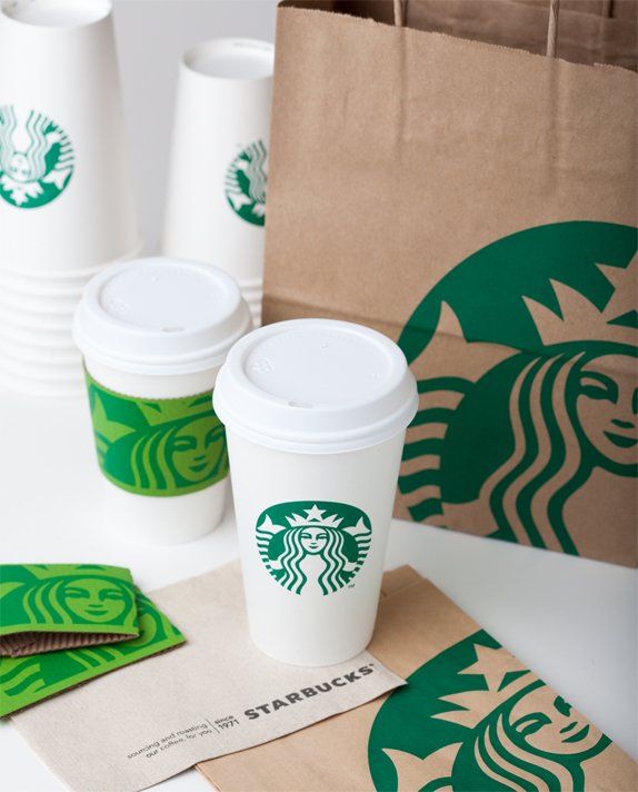
As a design element, this new evolution is a beautiful step in the right direction and looks simply amazing on the company's collateral materials (cups, bags, products, etc). Starbucks is probably one of the few exceptions (alongside those mentioned above) that has enough reach and recognition to pull something like this off and it's refreshing to see someone taking such a bold creative step towards creating something different.