

I recently read a great article on American Express' OPEN Forum site that discussed how important web design is to a person's online customer experience. These could be customers coming to your site to buy products or services or simply people looking for more information on who you are and what you do. Regardless, the importance that your website design has is no different. Both large companies and small can suffer equally from a design that is either poorly developed or amateurishly executed.
The article I read, written by Matt Silverman of Mashable, went on to discuss several samples of small business websites that professional web designers selected as not only some the better looking small business websites, but the most effective as well. Though many of the sites chosen for that article were from larger cities all across the world, it got me thinking of what fundamental elements they had in common.
Among the most referenced compliment towards these sites, each designer noted how effectively the sites' design conveyed an overall personality or "feel." More specifically, each design used a combination of "colors, typography, textures, and photography" to express it's desired appeal. This appeal could be luxury, simplicity, or simply an appreciation for customer satisfaction but the real key is that they each strike a chord with their intended target audience.
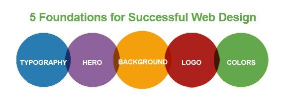
It's crucial not to overstate the importance of any one element to create this affect. As such, the following is a list of the most common elements which work together to form a strong brand message and thus a better user experience.
Logo
Although an awesome logo alone will not provide enough resonance with a visitor to create that sense of trust or entertainment, the time invested in a logo that speaks to your core audience will reassure them that they can trust you.
Header/Hero Image

A strong header graphic (or rotation of images) should convey a consistent brand message to customers. Think of this image (or images) as bullet points in your company's core characteristics. Each header should be indicative of a different part of your overall culture both in its imagery and any text that might be included.
Background

Often times, a website's background can be used to add an additional level of depth to a customer's experience. For instance, in the example above with Half Shell Oyster, we brought the restaurant's laid-back, coastal them into the background which not only created a richer experience while viewing it, but also helps to further communicate the company's culture.
Typography
Believe it or not, the style of typography (or fonts) you use both on your website and in your marketing materials can say a lot about you (whether you intend it to or not). For the most part, serif fonts (those with the little edges on them like Times New Roman) are often used by businesses to project a more authoritative position in the minds of customers. This style of font is often used by larger organizations such as law firms, investment companies, banks, etc.
Another important factor to consider when selecting fonts is size. The larger a font is depicted the more urgent and "louder" your message is perceived. Of course, no one likes to be screamed at all the time so it's best to use such devices sparingly.
Colors

Finally, colors have quite a large impact on a visitor's experience on a psychological level. That's not to say that there exists some magical color palette which will trick people into buying your goods and services, moreso it infers that we (as humans) have developed a sense of color-oriented instinct that provides us with certain clues in dealing with a given situation. As an example, traffic lights are all built with three different colors: green (go), yellow (caution), and red (danger). These cues are generally universal and, to some degree, also affect how a person can view your website.
Though there are exceptions to every rule, the behavioral patterns associated with color is for the most part consistent; warm colors such as red, yellow, and orange signify a fight or flight response while cool colors provide a more soothing and less urgent atmosphere. No color choice is either wrong or right, however, it should nonetheless be a deciding factor when planning you web design.